Designing a Product That Helps Consumers Choose Their Health Insurance Plan
Shopping for health insurance can be overwhelming, confusing, and have significant financial consequences. I volunteer assisting individuals and families sign up for health coverage on Healthcare.gov. The majority of people I work with have never had health insurance before, and I spend a lot of time with my clients trying to explain how the coverage “works”. This often leads to confusion and frustration for everyone involved.

Could I find a better way to explain how health insurance works and improve the plan shopping experience?
Research
I started with a self-assessment of what I found confusing or difficult to explain to others about medical coverage:
The terminology and naming conventions were often confusing or misleading.
Costs were not always transparent or consistent.
It’s not always clear who to ask questions to about their bills or services
Rules and policies sometimes change without advance notice.
Next, I did a series of client interviews to find out what their pain points were. I had access to a wide array of users: in addition to assisting clients through volunteering, I also have a freelance job helping a local restaurant sign up employees during their open enrollment period. People were eager to share their perspectives, and some common themes emerged.

“It seems so expensive. I don't really understand what I’m paying for.”
“I feel taken advantage of. I got insurance last year, but every time I went to the doctor, I still got a bill.”
“I’m resentful because I’m signing up for something that I feel like I have to have, but will never use.”
Resentment, confusion, helplessness, and the lack of satisfaction over the premium costs were common complaints from clients, whether they were signing up through the Marketplace or their employer.
When I asked clients how they felt about paying for car or home insurance premiums, they often did not see a correlation. As one client pointed out: “I drive my car every day. I live in my house. But I never use my health insurance!” This observation helped me understand what was lacking in the user experience.
Other forms of insurance, like car or homeowners’ insurance, provide a transactional experience because users interact with a tangible product. Our health and well-being are hard to quantify.
I ran a second round of interviews. This time I asked interviewees what factors they took into consideration when choosing a plan, and which parts of the process were most confusing or stressful, and created a journey map to chart the experience.

DESIGN EXPLORATION
What does predicting future health needs look like?
I’d learned from client interviews that users tended to have a reactive instead of a proactive stance towards insurance, since they primarily used it when they were sick or injured, feeling under stress, or in a state of crisis. As I considered the element of risk or forecasting that’s inherent in the insurance experience, I explored some ideas using a design sprint exercise.
How could users strategize to pick the best plans for themselves?
DESIGN CONCEPT
Since understanding your own comfort level with risk and responsibility is an integral part to figuring out which plan might be the best fit, I thought a game that involved both role playing and chance would be a good design concept.

The goal was to give players a better understanding of how health insurance works and I didn’t want to cloud that initiative with the additional burden of learning a complicated set of rules. I kept the game design simple: a “race game” similar to Milton Bradley’s Life. I tested out a prototype with individual players and a few game cards to see if the concept was viable.

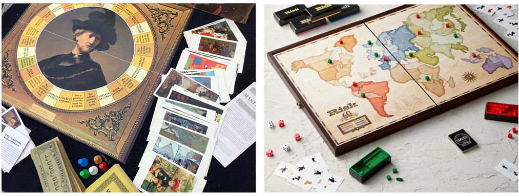
I was inspired by the stories of real-world adventurers like Roald Amundsen and Nellie Bly, and by fictional explorers like Phileas Fogg from Around the World in 80 Days. Buying health insurance is a bit of an adventure, after all. I used the look and feel of board games like Risk and Masterpiece for visual inspiration.
GAME DESIGN & CONTENT CREATION
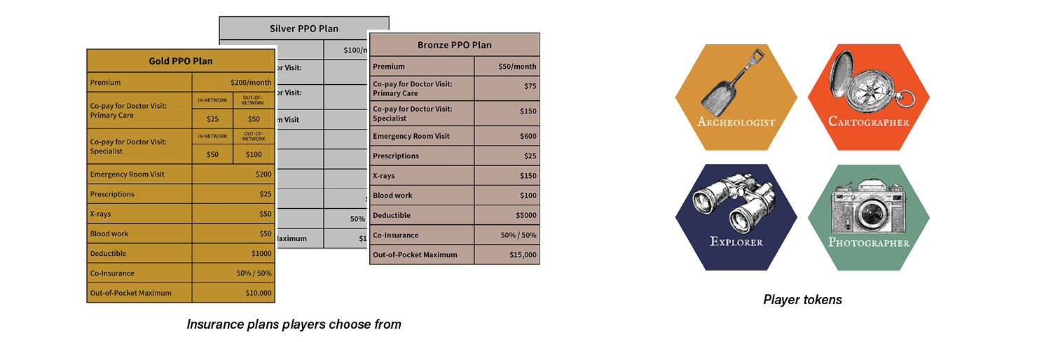
The premise: The year is 1923, and you’ve entered a wager with your fellow adventurers to see who can win a race around the world. You’ll face triumphs, danger, and thrills as you trek across seven continents. When an ailment or injury occurs, you must figure out how to best use their insurance to meet your medical needs. The first player to make it around the world without going bankrupt wins!
To begin: Each player chooses a token to travel around the board, receives a cash bank and purchases a health insurance plan. The plans are based on the Bronze, Silver and Gold tiers used on Healthcare.gov’s Marketplace, with the premiums due each time a player passes across a color border.
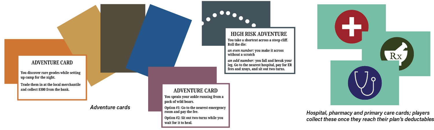
Players then take turns rolling the die and moving the corresponding number of spaces to travel across the map.

At each stop, players draw an adventure card of the corresponding color to find out their next move. Players can choose shortcuts - the “high risk bridges” - but they must draw adventure cards from this pile, where the consequences are more dire. If players need care, they travel back to the nearest hospital, doctor or pharmacy.
NEXT STEPS
I’d like to make this an online, interactive tool for HR administrators and health insurance assistors to use with employees and clients. The insurance plans in the game can be customized to match the plan details that are being offered to the user, as well as plan types, languages and even the complexity of the scenarios users encounter.
FEEBACK & REFLECTION
I learned a lot while making this version of the game, and testing it with users brought up many great ideas and suggestions:
include additional health insurance plans to choose from, including HSA’s, HMO’s, Medicare and Medicaid
add credits players can gain by engaging in “healthy” or preventative behavior, such as getting a flu shot or dental check up
explore the potential to add excitement and strategy to the game if players could engage with one another on the board
the language and tone might be a barrier for users; explore ways to further simplify the language, or create a version that involved less language and had more visual cues
create versions of the game for people with different levels of experience. A beginner’s version would teach users what the different terms are and have a shorter round of play.
Users agreed that shopping for health insurance is not fun, but having a understanding of what you’re purchasing could help make it less difficult.